Monday, February 28, 2011

Weekend Fun, Movies and Magazines!

Good morning all! How was your weekend? Mine involved a whirlwind trip back to Auckland to surprise my Dad on his 80th birthday! The look on his face when I turned up at the door on Friday afternoon was priceless (sorry no pix!). It was a special time with family and being able to catch-up with friends.

Plus, I was able to indulge in some magazine reading on the plane (even though I have tried to hone back on my magazine purchases!) The latest Home Beautiful and Australian House and Garden are definitely worth a read if you live Down Under.

I now want to make this recipe - fettucine with prawns, tomato, chilli and capers ...

Home Beautiful, pg 148

Was inspired by these grey tones and industrial style in this room ...

Home Beautiful, pg 49.
 And got caught up in the romanticism and dreamy whites of stylist Lyn Gardener's home - even though it's not really my style ...

Australian House & Garden, pg 94.

And the Australian House & Garden even came in handy when I couldn't watch the gruesome arm-chopping scene in the movie '127 Hours' - as a screen cover! 

P.S. If you haven't seen it, don't be put off by the five minutes of yuk as it is a fanstically done movie - very gripping and heart-wrenching knowing that it is a true story. I'm note sure if it's up for any Oscars but I can't wait to find out what movies will be winners. What are your picks?


Thursday, February 24, 2011

Still no Roof but think about the Kiwis


Well, we're nearly at the end of February and we've still got no roof on the house when it was supposed to be on before Christmas!

And the reason is the gutters. I know - who would have thought a gutter could cause such a lengthy delay?


Turns out our architect had specified a special design of the guttering in keeping with the aesthetics of the build (which we weren't really aware of or maybe we just weren't paying any attention?!) and this has been causing some design problems for the company making it. While we, of course, appreciate good aesthetics,  we would much prefer a gutter that worked than just looked good!

Anyhow, I believe progress is being made and it is now on 'critical path' as they keep saying (which is builder's speak for being urgent!). 

Yet despite all of this, I feel hesitant to really complain about anything at all when my fellow Kiwis in Christchurch are suffering, what is being said to be, the worst natural disaster New Zealand has experienced. My heart goes out to them and so, really, who cares about gutters?


Monday, February 21, 2011

Oh deer, no more, I say!

There has been a huge interior design trend for at least a year or two where fake (or sometimes real) antlers and even faux animals heads are used to decorate walls and I admit I've quite liked the look. Until now.


If I see anymore rooms with antlers in them, I think I'm going to scream!
Enough already, I say.


Image via Meghan Blum

Does anyone else feel the same way?

Friday, February 18, 2011

What is that doing there?

Hugh the Digger has been hard at work removing the rubble that had built up to gargantuan proportions on the front garden and preparing the site for the entrance walkway and lower lawn.


But we got an unexpected visitor. Yep, you guessed it, a vast expanse of pipe - which actually looks bigger than this in person! We were horrified.

Now, I know what I am about to tell you sounds unbelievable but it's true. Everyone knew there was a water pipe running through our property but when Sydney Water was initially consulted about the pipe's exact  depth and measurements, they said they had no record of it even though its end is visible outside our property on council land. Despite this, we (ie the architect) had to work around it re the landscaping and submit the plans to Sydney Water for their approval - which we got without a hitch.


Until Hugh got to work. The pipe was way higher in the ground than anyone expected. Oh dear. But, thankfully, not only is the exposed part going to be mostly under the walkway but our architect has come up with a great solution to build a sandstone wall around it that will blend in with what will be raised garden beds in sandstone, to extend the garden bed to the right of the lawn and  raise the height of the lawn a little so it is fully submerged.

Looking at it now, it's hard to believe it could ever be made to disappear but let's hope it vanishes forever otherwise mowing the lawn could be a nightmare!


Hard to believe, I know, but this will be the front lawn with trees lining the back fence and garden beds and/or vege patch to the back and sides.

Monday, February 14, 2011

Tracy Kendall Wallpaper

Where have I been not to have been aware of British designer Tracy Kendall's bespoke wallpaper?


Thankfully my interior design friend, Rachel, pointed her out to me a couple of days ago and suggested I consider one of her text designs for the toilet/powder room in the upstairs living area which I was planning on wallpapering.

You could catch up with world news (not sure on what exactly!) while you're spending a tinkle and emerge feeling instantly more knowledgeable with the Newsprint design.


Or take in a bit of Shakespeare with the Midsummer's Nights Dream paper.


Or ponder books you might one day read with the Books' designs.


I wouldn't put a set of cutlery in a toilet but how great would they look in a kitchen/dining space?


And I doubt sequinned wallpaper would last long in a household with children and dogs!


But I think one that might work is this Text design which reads whichever way you want!

Friday, February 11, 2011

No more scaffolding!

More pretty pictures of the house as it stands ...


Hugh the Digger is back to work clearing the rubble at the front of the house to make room for the front garden, entrance walkway and garage (except I've just heard he's been a bit naughty and has inadvertently exposed the stormwater pipe underneath - aagh!)


View of the front entrance and the stairs going down to the second level.
There will one day be stairs going up as well!


And, turning around, this is the view out of the non-existent window to the covered deck outside the rumpus room.
 

View from the far end of the deck (the kitchen end) showing stairs going down to what will be the barbecue area.


View from the master bedroom through the ensuite to the study. There are a few wall structures missing, of course.


The deck outside the rumpus room, showing four of the transplanted tree ferns and the site office.


Eldest daughter's bedroom.

Enjoy the weekend!

Wednesday, February 9, 2011

Much ado about the splashback


If you have been following this blog for a while, you will know I had my heart set on a clear glass splashback in the kitchen right from the start. It was established that, providing we changed the current view from its lofty position (ie rickety old fence and a motley collection of neighbourly plants), it could be a great feature and would work well. You can see its long rectangular frame here, behind which we plan to have a row of bamboo planted on the ground floor below that will provide a vibrant splash of greenery and a nicer view.

The architect then suggested the splashback also act as a sliding window (to match other sliding windows in the house) and to have no joins and no visible framing. We said "sure". The builder was visibly excited about this design feature and was determined we - ie he, the architect, engineer and glass contractor - could do it.

Except only last week, we found out the engineering logistics required to make this happen. With such a long, big piece of glass it obviously needed to function safely and also be able to slide into the wall cavity and not affect the toilet window at the other end of the same wall.

Listening to them discuss the ins and outs and potential difficulties, we began to wonder if it needed to open at all. I mean, half the living area completely opens up anyway, so it's not like we need the ventilation.

Cue email to architect, saying: let's save some time and money and ditch the fully openable splashback and concentrate on something else - like sorting out the feature niches I'd like in the dining space or how we're going to move the tree ferns for a second time!

Monday, February 7, 2011

It's all coming along nicely

Having not posted many photos recently of the house, you must be wondering if we are actually still building one! But yes, despite still not having a roof over the upper living space - problems with some new-fangled gutter design our architect is wanting to have! - and being a few weeks behind, the build is forging ahead and we are supposedly still on track to meet the completion date. This time, at the site, I remembered my camera and, with the interior scaffolding now removed, I was able to click away with a vengeance.

It is so exciting to see the main living and kitchen space being formed - as it is the only part of the house that won't have internal brick cladding, we've had to wait for the steel supporting beams to be installed so that the timber frame and roof can go on. Even though there are no walls, we really got a sense of what it will be like.


Looking skyward on a scorching day.


The steel beams show where the house ends and the deck starts (excluding the beam that fixes itself to the deck railing). The roof will extend part-way over the deck for shade.


The steel work table to the left is kind of where the kitchen island bench will be.


Looking through to the pantry, mini wine cellar (I hesitate to use the word 'cellar' as it's more like a holding room for wines we will be about to quaff!) and toilet (not all in the one room, of course).

More images to come throughout the week ...

Thursday, February 3, 2011

Help! Bathroom Lighting

Help me people! I need to source some lights for our ensuite bathroom. And I'm struggling to find anything that rocks my boat. Or am I being too fussy?

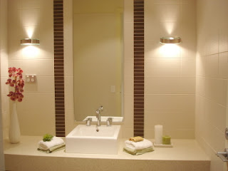
The thing is, we've got the ubiquitous downlight in the shower recess and over the bath and toilet but I'm wanting something that will offer great functionality but also look good either side of the mirror.

I love the chandelier option. But that just won't work in our bathroom.

Image via Modeco Design

And I can see the appeal of unobtrusive modern lights.

Image via Home Insights

Image via Halogen lamps

But I wonder if there's anything different out there that could be used. Not too different but a little. I know that's not much of a brief but I've got the electrician poised to begin the behind-the-scenes prep and I kind of need to let him know what we're putting there. Ideas, anyone?

LinkWithin

Related Posts with Thumbnails