Sunday, August 29, 2010

Let the Brickwork Begin

After not a lot of action, we now have lots happening. I had a site meeting on Friday with the builder-project manager, the architect and his side-kick, an Irish work-experience architect and the foreman, plus four brickies and three other workman working on the site. As the only female there, you could say I felt outnumbered! But it was very exciting to see the old bricks from the original house being laid as part of the reverse brick veneer cladding. Already the outline of the downstairs rumpus room, guest bedroom and ensuite and their window placements are clearly visible. It was amazing to finally get a concrete - so to speak - feel for some of the house and to walk through it. Over the next two weeks, the pool will be formed, more bricks laid and all the dirt next to the concrete slab moved so the second slab can go down. And next time I'll remember to take my camera on site so I can take better pictures - instead of taking them behind the fence after everyone had left for the day like I did here!

The alcove, if you can call it that, in the middle is the guest ensuite.

View through Hugh, the digger.

The concrete block retaining wall on which the second slab will be formed. The rectangular bit sticking out is where the bath in the master ensuite will be, with a window so you can look out at the trees beyond.

My friend, Hugh the digger, takes a rest after a long week's work.

I think I know why I love him so much: his colour brightens the drab grey of everything else!
Even the frangipani tree, which hasn't come into flower yet, is grey.

Hugh's girlfriend has come onto the scene. I think we might have to christen her, too ...

Friday, August 27, 2010

When a Room goes Pop!

Image via Belle Maison

At first glance you may think, 'nice room'. But if you look at the detail I think there is much to love. The olive green armchair draws you in. It looks so inviting especially teamed with a gorgeously bright cushion. Then there's the rustic coffee table (even though nothing else in the room is rustic), the butterfly print, the modern fireplace and built-in chunky shelving, the peacock-inspired rug and circular side table. I love a good bit of inspiration.

Happy weekend everyone!

Wednesday, August 25, 2010

Let the concrete begin

Hooray! We have concrete.


Slab number one goes down.


And a little bit more to the side (the hole for the pool lies behind).


And my favourite turquoise digger takes centre stage.

Monday, August 23, 2010

Vogue Living

It was the cover that did it for me. Rustic wood table, white-on-white, stunning green glass bottle and cool mirror art. It's this month's revamped Vogue Living magazine. I couldn't resist.


Then this blew me away. Looks like a rug or painted floorboards, right? But no, it's dust! Yes, that's right, dust. Artist Hannah Bertram shapes intricate patterns from stencils and sprinkles dust collected from within the art's location (ie someone's gorgeous house) to create installation art. These will be exhibited at Melbourne's Dianne Tanzer Gallery from September 23 to October 16 and called appropriately The Silence of Becoming and Disappearing.


The magazine also features interior designer Andrew Parr's colourful take on his Victorian weatherboard house. Love the armchair.


And who would have thought Green Pirelli rubber flooring could look so good? It's certainly perfect with the black and white colour scheme.


Turkish interior designer, Zeynep Fadillioglu, opens up her house too. And what a place! It's more like a museum with gorgeous Ottoman, 18th and 19th century European furnishings and antiques. Not sure I could live here though.


The Kelly Wearstler-designed pool cabanas at the LA Avalon Hotel feature stunning wallpaper, lights and mirrors.


But this is my favourite: a guesthouse in Provence transformed by French interior designer Jacqueline Morabito. The shattered glass artwork by Karim Ghelloussi looks amazing. Even the simple plastic sheeting over the table is a nice touch.


By the way, the concrete slabs are now being poured tomorrow. Have never been so frustrated or excited about concrete in my life before! Watch this space ...

Thursday, August 19, 2010

Hotel Eye Candy


Can you believe this is a hotel? Well, for that matter, how amazing would it be if it were someone's house!


It is the recently opened W Hotels Retreat & Spa on Vieques island, located off the southeast coast of Puerto Rico in the Caribbean whose interiors were done by the fabulous Spanish-born, Milan-based designer Patricia Urquiola. Yum, yum ...


Images via The Contemporist

Tuesday, August 17, 2010

My new retro phone


Check out my new old phone! Even though I grew up with one of these (in cream) I've always fancied having one and I love the retro look. On the weekend I popped into the Manly Antiques Centre and wondered why I had never been before. It's a veritable treasure trove of everything from antique furniture to vintage clothes, old shop signs and everything else in between. And this is where I found the phone.


My new purchase is now a source of fascination for my girls who had never seen such a phone before and didn't know how to work it! I think they think it's a new toy - which, in a way, I guess it is!

The retro green number was said to be in working order when I bought it but with a silent ring (if that's possible!). However, when I got home I found that it does make a ringing sound when someone calls but it won't ring out. A recorded voice says it doesn't recognise the phone numbers. I think it's to do with our line rather than anything else as the lady in the shop said she was able to call out when she was testing it. All very weird and kind of quirky but it only cost $30 so hardly broke the bank.

The phone jack is in the kitchen so this is where it has to live for now, by the fruit bowl.

But I would like to get it checked out and maybe see if it can be adjusted to not only work properly but be digitised - which is the way all phones and phone lines are heading. Anyone have any ideas of how best to do this?

Monday, August 16, 2010

Week 7 & 8 of the Build


Don't you love a good footings pipe? I do - especially when they're going in the ground!


Unfortunately we lost a whole week because of rain so not a lot has been done. Basically the foundations need to be laid and the pool formed but the guys couldn't do it as when the ground gets drenched it needs three days to dry out.


The good news is it's sunny again and the weather is forecast to be fine for the next seven days and the guys on site are now working full steam ahead to make up for lost time.


The plan: form and slab the lower living level (the top 'wing', seen here, on the higher ground), the bricklayer to start laying bricks on this level, then do the same on the lower level footings (ie the bedroom 'wing'), finish the pool excavation and form the pool (ie pour concrete).


 The bricks from the original house sit in a neat pile waiting to be re-used.


I know this doesn't look at all interesting but it was exciting for me because this is the first time I've been able to see exactly where the kitchen splashback will be. You can see its spot marked in fluorescent on the fence (but it will obviously be further away from the fence line). What this means is I can have my desired clear glass splashback with a beautiful view of star jasmine growing up wires from planters fixed to the wall - rather than the view of a grotty fence or a motley collection of trees. We will replace the old wobbly fence and make it a little taller and scrub up the stonework so it looks a lot nicer as well.


That's all for now, folks, and so it's goodbye from me in my sparkly Target gumboots!

Thursday, August 12, 2010

The Atlantic at Byron Bay

I took some quick snaps on my phone of the place my girlfriends and I stayed in while at Byron Bay last weekend. The Atlantic guesthouses at Byron are a very beachy, laid-back style of accommodation where white was the mainstay of the interior design. In fact, we all agreed that all white rooms ie white floors, walls, kitchen, furnishings and bedding, which look fab in magazines, could actually be too much - especially in winter. We all wanted to inject a bit of colour - even if it was a dash of grey - to the interior of the one we were in - the Premium Ensuite (which actually looks more colourful on the website). But check out the exteriors - black with white trim and lots of palm trees.

 Outside the Standard Ensuite

 The Skippers' door

 The seahorse outside our door

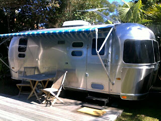
The Airstream - funky silver caravan-style accommodation

 Kid's cubby house

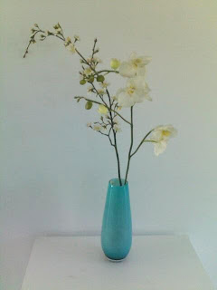
Beautiful turquoise vase and orchids in our room - the only splash of colour

Oh, to be back there again!

Wednesday, August 11, 2010

Shannon Fricke's Workshop

Well, what a whirlwind, action-packed weekend! Shannon Fricke's 'How to Decorate' workshop was crammed full of insight into interior decorating and now my brain is crammed full of ideas and overloaded with information!


Basically it was all about discovering 'your story' - what you like, what makes you tick, what inspires you - so you could then translate that into an interior design 'story'.


This is where moodboards came in and we indulged ourselves in the boxes and baskets of buttons, shells, fabrics, wallpapers, stones, feathers etc that Shannon supplied and, using the things we had brought along that inspire us, as well as magazine clippings, we set about creating our own moodboards with a particular room or space in mind.


Sounds easy? Well, I can tell you, I got flummoxed. Tried to cram too many things onto it. Couldn't work out what I liked the most and what to cull. Couldn't work out my base story (ie the main theme - be it a certain colour or a certain style) or what could be perfect highlights and accessories (ie how to layer). I decided to stick to our main living area and my moodboard ended up looking like this (below) which didn't look nearly as good as some of the others (many of whom had clearly mucked around with moodboards before and created works of art).


Shannon's take on it was the pale greys and whites could be my main theme - say with the grey on the bottom right as a wall colour - and the bolder greens and turquoises as accent colours. She said I tended towards angular, geometric shapes ie the mid-century chair in the middle and the chair and painting in the bottom-middle image - which is pretty true. She told us how it was all about learning to read what exactly it is you like about an object or a picture. It may not be the overall image; it could just be the soft curves of a stone rather than its colour, or the mix of patterns in a room rather than the individual pieces of furniture.

In the end, I decided it was far better to look up and away from the clutter. And this is what was above: colourful bunting created from strips of fabric cuttings tied onto hessian-type fabric that was strung across the ceiling beams and stunning, simple light fittings that are over-sized light globes - not designer as they looked, but bought from any old lighting shop, so says Shannon.


We also learnt a bit about colour and textiles and to remember that you're creating something for you and your family to live in and no one else. That it has to reflect you and your family and not be a replica of someone else's house. It was a great bunch of girls (yes, 14 of us) who all liked blues, greens and whites and the chance to escape domestic life!

I'm afraid I didn't take too many other photos, though, as I was too engrossed and these were only taken on my phone. But you can check out Shannon's blog and website for more and for a better look at her little, cute work cottage in Bangalow. She has already posted some pictures of the workshop as well - but thankfully none of me!

That's all for now!
Jx

Monday, August 9, 2010

Rock Chick Ruby

I got back from Byron Bay last night and have so many ideas from Shannon Fricke's interior design workshop which I will tell you all about in the next post.

But I couldn't resist showing you Ruby's new look ...


She looks both ridiculous and too cool for school! Have a great day, J :)

Friday, August 6, 2010

Workshop & Lighting

I'm actually up a Byron Bay for the weekend as today I'm doing interior designer Shannon Fricke's 'How to Decorate' day workshop at her place in Bangalow. Click here to find out what we'll be doing. I'm very excited and can't wait to tell you all I've learnt. The Byron Bay Writer's Festival also happens to be on and the two girlfriends I am with will be checking out some of the sessions there as well. Ooh, did I tell you I'm excited?!

Image from Homelife

In the meantime, I thought I'd leave you with some images of beautiful pendant lights. I had a very in-depth meeting with our architect on our lighting and it's made me think about what sort of pendants I'd like to have hanging in different parts of the house. For, as I have an aversion to an abundance of downlights, I have specified as many pendants as possible. But what I didn't realise was that many lights are still made to hold standard bulbs and not LEDs or fluoros (fluorescent lights) and to comply with the NSW Basix green building code all the primary lights in each room must have environmentally friendly globes. Now I'm more than happy to have every light as sustainable as possible, but with pendants it could limit our choice.

Interior stylist Katarina Grundstromer's summer house. Image from Emmas blog

Image from Home Life

Mooi pendant light. Image from Australian House and Garden

Image by photographer James Brand via The Design Files

Tom Dixon lights from Dedece

I love all of these. What about you? Do you have a favourite?

LinkWithin

Related Posts with Thumbnails