Wednesday, September 29, 2010

Living etc & Bright Bazaar giveaway

There's nothing better than a good dose of recycling and upcycling.


Image: Livingetc

Love this old grain sack-covered chair and bright green seat belt cushion. The light is no doubt new, but has an old (in a good way), recycled look about it too!

Now, if you love Livingetc as much I do and as much as Will at Bright.Bazaar does, check out his giveaway of two yearly subscriptions to the mag over at his blog.


Monday, September 27, 2010

The Pool


Hello online friends! What a hectic few days I've had (spending quality time with the hubby) and with no chance to get online and blog or peruse other people's beautiful blogs. But with the girls visiting their grandparents in NZ - on their own for the first time (!) - I am hoping to be able to get back into it.

And I'm very pleased to finally be able to say that the pool has now been formed and the concrete poured. I have to show you photos of course, even though it is highly uninspiring (unlike the image above).


As you can see it is kind of a cross between a lap pool and a normal pool - narrower and shallower at one end, getting wider and deeper at the other. Semi-established Lilly pilly native trees will line the eastern side, bordering our neighbours and timber decking will form the surround. While we were limited by space and the geography of the land and there isn't a huge amount of area around it, there is enough to put a couple of sun loungers at the narrower end.

But, hey, it's a pool! We've never owned a pool before so we can't wait to be able to jump in and cool off during the heat of a Sydney summer.

Wednesday, September 22, 2010

eBay Makes my Day!

For someone who has sold virtually the entire fit-out of their old house, plus eight-seater dining table with chairs and dresser a couple of years ago on eBay, I had yet to actually purchase anything.

Until now.

That's not to say I hadn't perused eBay's wares or even bid on some items. But I either chickened out, the price got too high, I was consistently outbid, or I wasn't sure I actually wanted the item or not.

In the end, I decided to try my luck on a 70s retro glass genie bottle. And I won!


I may now have to get a couple more to keep it company!

Monday, September 20, 2010

Yardage Design

I have a new project, which was spurred on by my discovery of some fabulous hand screen-printed fabric from Melburnian Nicole James, creator of Yardage Design! Nicole hand screen-prints natural fibre-based cloths such as organic cotton, linen and hemp using water-based inks. The fabric I was particularly attracted to was her Agapanthus design which she does in white on coffee-coloured cotton, or purple on cream.


We inherited two rather tired and grubby looking cane chairs up at the batch that are still structurally sound and comfy to sit on. I thought I would spray paint them white and replace the old, starting to mould, cushions with ones made in Nicole's agapanthus fabric shown here that arrived in the post last week, with a cream cotton backing I picked up at Spotlight on the weekend.  


Nicole also has a fabulous blog (which is how I found out about her in the first place) and a website and online store which I highly recommend you check out to see her other wares, such as bunting, tea towels and eco-bags.
 
I'll show you the end result when it's all done!

Friday, September 17, 2010

Tree Ferns

In an effort to keep the tree ferns that were growing from the rocky promontery in the back garden that we've basically cut in half to get more lawn (it is outside the picture to the left), we've transplanted them in the middle of what will be the back lawn where they can get both sun and shade and hopefully, continue living.


They look a bit sad at the moment, but cross fingers they will survive the upheaval. With Spring here and the sun shining, this has almost got me enthused about doing some gardening. Although, the closest I'll probably get is helping my girls plant the seedlings we bought a week ago. They definitely have more of a gardening gene than I do! But I do enjoy colourful spring flowers and fresh tomatoes, don't you?

Happy weekend everyone ...

Wednesday, September 15, 2010

Mirror #2 Gets a Revamp

So I was hating our long mirror. It functioned fine: didn't distort the figure in any way and was useful in ensuring the bottom half was dressed in a vaguely adequate way. BUT it was a horrible timber veneer. Have had it for years and never really enjoyed looking at it. So ... I got out the silver paint again. You'll be pleased to know that I didn't take any before shots as I was too eager to attack it with some paint! So here it is primed.


And ta da! Here is the result ...


While it looks a lot better than it did before and now matches the mirror on the mantel that I painted silver, it still seems lacking in something. I had thought about doing a decorative pattern in fine black paint around the top sides but as I've never done that before am not sure that's such a good idea.


Any suggestions? Or am I better off leaving as is?

Monday, September 13, 2010

Weatherboard Cladding

I've always liked weatherboard. Whether modern or traditional in style.

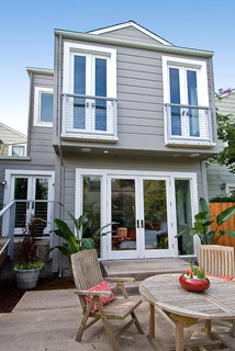
Noe Valley Three contemporary exterior


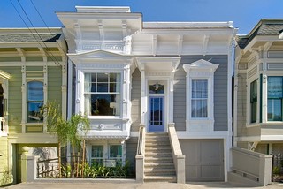
Noe Valley Three contemporary exterior

Images via Houzz

Which is why our house, while modern in design, will be all-white weatherboard. Here is an unpainted mock-up of what the cladding will look like. Not the greatest photo but you get the idea and it will be white, not cream.


And this is a little like what our upstairs living will be - with the timber decking, an extended roof for shade and kitchen window overlooking the decking.

{Apologies: I cannot source this image as I've had it on file for ages and didn't keep the web source. If anyone knows it, please let me know!}

The brickwork will be tucked away inside, in between insulation and the internal cladding. So I will still be, technically speaking, 'the girl in the brick house'!

Friday, September 10, 2010

News from the Building Site

Popped down to the site today for a meeting with the architect and project manager. And this is where they're at ...


The brick work on the lower level living area is complete.
This is a view from the rumpus room through to the guest bedroom.


The rumpus room wall and windows (which will be louvres), east-side.


The guest bedroom ensuite (I know it looks a little prison-like, but squint a little and you'll get the idea).
You walk in and there's a window to your left, the vanity and mirror straight ahead and the toilet and shower to your right.


5.5-tonne Deb takes a break in the guest bedroom.


The old garage is gone and is now replaced with excess soil from the levelling of the second 'wing'.


A pile of old bricks ready to be used on the second wing.


The pool is formed.

Yipee for progress! Have a happy weekend folks ...

Wednesday, September 8, 2010

Wallpaper Update

Am loving innovative uses for wallpaper. How about this gorgeous blue paper used to zhush a dresser for a unique home office decor ..?

Image from Living Etc

Now, I have to say that after all your wonderful comments to Monday's post on Vivienne Westwood's Union Jack wallpaper for Cole & Son, I was encouraged to find out more about it. And you know what, I didn't faint from shock. In fact, I was pleasantly surprised. I don't know what I thought the cost would be but $550 for a panel virtually the size of a wall (at 270 x 150 cm), didn't seem too bad. And considering it's like a piece of art, then that price is pretty reasonable, don't you think? As there is no stock in Australia it must be pre-ordered and takes about two weeks from the UK.

Monday, September 6, 2010

Union Jack Wallpaper

An interior design friend of mine has discovered the perfect wallpaper for me to go with my British and NZ-inspired cushions: Cole & Son's Union Jack wallpaper panel designed by Vivienne Westwood.


Known for her use of iconic British imagery, the wallpaper was inspired by an antique flag recovered from a ship, reinterpreted with a weathered and sun-bleached look.

Image via Vogue UK

It is available in Australia through Radford Furnishings and while I have yet to see it in person and find out the cost (!), I think it could look really good on the back wall in the TV room. Here is a close-up of the paper which is made to look like real, worn fabric.


My Pony Rider and pohutukawa cushions from the Poi Room in Auckland.


What do you think?

Friday, September 3, 2010

And The Bricks Keep Going Up

A new house is being transformed from the old. 1920s bricks are forming the internal wall structure of the new house and the guest bedroom takes shape.


The rumpus room east-side wall and windows are formed.


Hugh takes a rest, but I am worried that the dimensions don't look right. The wall length between the two long windows is meant to be 3 m but doesn't look like it to me! Of course, as it turns out, it is an optical illusion but I'm thankful the architect checks it out for me as he discovers that all the door heights are too low!! Oh no! While they would have been picked up as my husband would have skimmed his head on them, it is much better the error can be rectified now rather than later.
{Moral of the story: It pays to check everything!}


There's now a delay with the pool formation because the poolman has been held up on another job, which means we can't lay the second slab and progress the brickwork on this wing. Grrr!
{Moral of the story: Must remember that patience is a virtue}
 

Spring may have sprung but there are still no buds on our frangipani tree.
{Moral of the story: See moral # 2 above}


Wishing you all a very happy weekend!

Wednesday, September 1, 2010

Miles of Tiles

You can't go wrong with a fab tile or two but just look how they can make a difference ...


I love everything about this corner of a room - from the chair to the sideboard. But have a closer look at the picture: it's an oil painting framed in mirror mosaics. Who would have thought to even do that?!

Image 1 & 2 from Living Etc

What a great way to use up a collection of mis-matched tiles and aren't the colours pretty?

Image from Belle Maison

Beautiful kitchen splashback.

Image by photographer James Braund via The Design Files

Striking, aqua-black (if there is such a colour!) glossy tiles on the splashback and metallic (almost) looking floor tiles with really interesting furniture make this essentially plain, neutral kitchen come alive!

LinkWithin

Related Posts with Thumbnails