Showing posts with label Design. Show all posts

Thursday, August 18, 2011

Virtual Renovating


Image via emmas blog (just because I liked it!)

I can't believe I never knew about these things until now: Renovating and decorating via free online websites that let you design houses and decorate rooms from the comfort of your ergonomic desk chair - or, in my case, my rather un-ergonomic dining chair.

And I can't believe I found out about one of them - Floor Planner - via my daughter. Yes, indeedy peoples, my 12-year-old is designing her very own virtual beach house for her Design and Technology class. Even my 10-year-old is doing it now and only last night showed me the top floor of her 'house' with its room full of arcade games - her idea of heaven clearly!

Then I read in the Sydney Morning Herald the other day about a whole raft of other such sites that I never knew about and quite frankly, could have used over the past year.

My Deco: where you can design a 3D room, add furniture, make moodboards and get ideas from other people's room designs.

Google Sketchup: which is a more architecturally inclined modelling program.

3Dream: uses video-game technology to allow you to draw up floor plans, add the joinery and then choose from real-life furniture, fabric swatches, lights and art.

They could be real time-wasters but I reckon if you're having a hard time envisaging a room or the plan of a house, they could be just what you need.

Has anyone used one of these before? I'd love to hear how it went!

Monday, December 20, 2010

All Dressed Up!


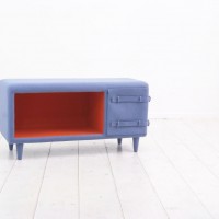
How cute are these?


Korean cuteness by design studio Kam-kam. These are part of their Dressed-Up Furniture series.


The designers say: The theme of “Dressed-up furniture series” is to combine clothes and furniture. It will make you feel fresh by mixing the familiar elements of normal actions like fastening a button and daily furniture like stool, storage and bench.


It's like opening a Christmas parcel!

{Images via The Contemporist}

Friday, November 5, 2010

Friday Fishin'


I wish had some riveting updates on our house build but there's really not a lot to say or show. Rain has held up the second floor slab going on and other work that's been completed (ie retaining walls, finishing the lower level brick work etc) isn't worthy of a either a photo or a blog post. Slowly but surely we are getting there but, like everyone in Sydney, we're sick of the cold, rainy, windy days that make it feel more like winter than spring.


I wouldn't mind jetting off to this house, though, that's not only got the weather but a rather amazing pool and house design that looks rather resort-like.


The Fish House which is described as a 'modern tropical bungalow' - which downplays it somewhat, don't you think? - is in Singapore and was designed by Guz Architects.


I mean, check out the master bedroom ensuite - what views, what size!

Enjoy the weekend folks!

Images via The Contemporist

Wednesday, October 27, 2010

I'm Dreamin' Of ... A Funky Bookcase

Yes, that's right, people I've decided to have a weekly section called 'I'm Dreamin' Of ...' to feature things that either I have been dreaming of owning, hadn't realised I was dreaming of owning until I saw them or just things I love that inspire lots of dreamy moments.


Today's piece is a funky bookcase by Colombian-based designers Malagana Design.


The Equilibrium bookcase turns your sense of balance on its head to give you something functional but quirky. Says Malagana's website: While its compartments seem to float in the air, Equilibrium can hold over 120 Lbs of weight and its different modules allow to keep books and magazines organized in a natural tilted position that eliminates the need for bookends.


I like.
I want.
I'll have to be content to dreaming about putting this quirky number in my living room.

Images via The Contemporist

Friday, October 15, 2010

Interior Inspiration

Have stumbled upon (via The Design Files) an interior design duo who are channelling exactly the kind of feel I'd like for our house. Fiona Lynch and Mardi Doherty of Doherty Lynch, based in Melbourne, use clean lines, neutral bases and then pop them with a burst of colour - often wallpaper - and I'm liking it.


Love, love, love this kitchen! You can read The Design Files' interview with them here.

Monday, October 4, 2010

Designer Chicken Coops


How cool is this? A designer chicken coop for all those budding inner city chicken owners out there.


Engineered and crafted by hand in the UK, the Nogg is made from strong cedar wood which is fresh scented and naturally antibacterial and is designed to house two to four chickens. It is the brainchild of furniture designer and engineer Matthew Hayward and Creative Director Nadia Turan.

They say: "The nogg is designed to enhance and compliment its surroundings and fit sculpturally with this aesthetic assumption. The nogg aids and advocates the provenance of homegrown foods. Chicken keeping has become a huge trend in the last 18 months and makes an ideal pet with benefits that delivers fresh eggs in the morning.

"It is a great example of how a random thought became a reality when a number of friends and relatives were excited about keeping chickens. It was upsetting to all of us how ugly, badly constructed and rudimentary the chicken coops were. It sparked a debate as to why we should be lumbered with an eyesore in our gardens."


Thank goodness for random thoughts!

Wednesday, September 15, 2010

Mirror #2 Gets a Revamp

So I was hating our long mirror. It functioned fine: didn't distort the figure in any way and was useful in ensuring the bottom half was dressed in a vaguely adequate way. BUT it was a horrible timber veneer. Have had it for years and never really enjoyed looking at it. So ... I got out the silver paint again. You'll be pleased to know that I didn't take any before shots as I was too eager to attack it with some paint! So here it is primed.


And ta da! Here is the result ...


While it looks a lot better than it did before and now matches the mirror on the mantel that I painted silver, it still seems lacking in something. I had thought about doing a decorative pattern in fine black paint around the top sides but as I've never done that before am not sure that's such a good idea.


Any suggestions? Or am I better off leaving as is?

Monday, September 13, 2010

Weatherboard Cladding

I've always liked weatherboard. Whether modern or traditional in style.

Noe Valley Three contemporary exterior


Noe Valley Three contemporary exterior

Images via Houzz

Which is why our house, while modern in design, will be all-white weatherboard. Here is an unpainted mock-up of what the cladding will look like. Not the greatest photo but you get the idea and it will be white, not cream.


And this is a little like what our upstairs living will be - with the timber decking, an extended roof for shade and kitchen window overlooking the decking.

{Apologies: I cannot source this image as I've had it on file for ages and didn't keep the web source. If anyone knows it, please let me know!}

The brickwork will be tucked away inside, in between insulation and the internal cladding. So I will still be, technically speaking, 'the girl in the brick house'!

Wednesday, September 8, 2010

Wallpaper Update

Am loving innovative uses for wallpaper. How about this gorgeous blue paper used to zhush a dresser for a unique home office decor ..?

Image from Living Etc

Now, I have to say that after all your wonderful comments to Monday's post on Vivienne Westwood's Union Jack wallpaper for Cole & Son, I was encouraged to find out more about it. And you know what, I didn't faint from shock. In fact, I was pleasantly surprised. I don't know what I thought the cost would be but $550 for a panel virtually the size of a wall (at 270 x 150 cm), didn't seem too bad. And considering it's like a piece of art, then that price is pretty reasonable, don't you think? As there is no stock in Australia it must be pre-ordered and takes about two weeks from the UK.

Wednesday, September 1, 2010

Miles of Tiles

You can't go wrong with a fab tile or two but just look how they can make a difference ...


I love everything about this corner of a room - from the chair to the sideboard. But have a closer look at the picture: it's an oil painting framed in mirror mosaics. Who would have thought to even do that?!

Image 1 & 2 from Living Etc

What a great way to use up a collection of mis-matched tiles and aren't the colours pretty?

Image from Belle Maison

Beautiful kitchen splashback.

Image by photographer James Braund via The Design Files

Striking, aqua-black (if there is such a colour!) glossy tiles on the splashback and metallic (almost) looking floor tiles with really interesting furniture make this essentially plain, neutral kitchen come alive!

Monday, August 23, 2010

Vogue Living

It was the cover that did it for me. Rustic wood table, white-on-white, stunning green glass bottle and cool mirror art. It's this month's revamped Vogue Living magazine. I couldn't resist.


Then this blew me away. Looks like a rug or painted floorboards, right? But no, it's dust! Yes, that's right, dust. Artist Hannah Bertram shapes intricate patterns from stencils and sprinkles dust collected from within the art's location (ie someone's gorgeous house) to create installation art. These will be exhibited at Melbourne's Dianne Tanzer Gallery from September 23 to October 16 and called appropriately The Silence of Becoming and Disappearing.


The magazine also features interior designer Andrew Parr's colourful take on his Victorian weatherboard house. Love the armchair.


And who would have thought Green Pirelli rubber flooring could look so good? It's certainly perfect with the black and white colour scheme.


Turkish interior designer, Zeynep Fadillioglu, opens up her house too. And what a place! It's more like a museum with gorgeous Ottoman, 18th and 19th century European furnishings and antiques. Not sure I could live here though.


The Kelly Wearstler-designed pool cabanas at the LA Avalon Hotel feature stunning wallpaper, lights and mirrors.


But this is my favourite: a guesthouse in Provence transformed by French interior designer Jacqueline Morabito. The shattered glass artwork by Karim Ghelloussi looks amazing. Even the simple plastic sheeting over the table is a nice touch.


By the way, the concrete slabs are now being poured tomorrow. Have never been so frustrated or excited about concrete in my life before! Watch this space ...

Tuesday, August 17, 2010

My new retro phone


Check out my new old phone! Even though I grew up with one of these (in cream) I've always fancied having one and I love the retro look. On the weekend I popped into the Manly Antiques Centre and wondered why I had never been before. It's a veritable treasure trove of everything from antique furniture to vintage clothes, old shop signs and everything else in between. And this is where I found the phone.


My new purchase is now a source of fascination for my girls who had never seen such a phone before and didn't know how to work it! I think they think it's a new toy - which, in a way, I guess it is!

The retro green number was said to be in working order when I bought it but with a silent ring (if that's possible!). However, when I got home I found that it does make a ringing sound when someone calls but it won't ring out. A recorded voice says it doesn't recognise the phone numbers. I think it's to do with our line rather than anything else as the lady in the shop said she was able to call out when she was testing it. All very weird and kind of quirky but it only cost $30 so hardly broke the bank.

The phone jack is in the kitchen so this is where it has to live for now, by the fruit bowl.

But I would like to get it checked out and maybe see if it can be adjusted to not only work properly but be digitised - which is the way all phones and phone lines are heading. Anyone have any ideas of how best to do this?

Friday, August 6, 2010

Workshop & Lighting

I'm actually up a Byron Bay for the weekend as today I'm doing interior designer Shannon Fricke's 'How to Decorate' day workshop at her place in Bangalow. Click here to find out what we'll be doing. I'm very excited and can't wait to tell you all I've learnt. The Byron Bay Writer's Festival also happens to be on and the two girlfriends I am with will be checking out some of the sessions there as well. Ooh, did I tell you I'm excited?!

Image from Homelife

In the meantime, I thought I'd leave you with some images of beautiful pendant lights. I had a very in-depth meeting with our architect on our lighting and it's made me think about what sort of pendants I'd like to have hanging in different parts of the house. For, as I have an aversion to an abundance of downlights, I have specified as many pendants as possible. But what I didn't realise was that many lights are still made to hold standard bulbs and not LEDs or fluoros (fluorescent lights) and to comply with the NSW Basix green building code all the primary lights in each room must have environmentally friendly globes. Now I'm more than happy to have every light as sustainable as possible, but with pendants it could limit our choice.

Interior stylist Katarina Grundstromer's summer house. Image from Emmas blog

Image from Home Life

Mooi pendant light. Image from Australian House and Garden

Image by photographer James Brand via The Design Files

Tom Dixon lights from Dedece

I love all of these. What about you? Do you have a favourite?

LinkWithin

Related Posts with Thumbnails